‘Any Work That Doesn’t Reflect Its Time Is Probably Very Shallow’
An Interview with João Emediato, the Co-Founder of Estúdio Lampejo
The Brazilian design studio Estúdio Lampejo was founded by Filipe Costa and João Emediato. Their main profile is to work on projects commissioned by artistic and cultural organisations. In order to learn more about their driving forces and design process, I’ve asked João.

The Brazilian street and graffiti art have their reputation abroad. But what should we know about the Brazilian design scene?
I couldn’t really define the Brazilian design scene, since we are such a huge country with a stunning diversity of cultures, and all have a very distinctive style. What interests us, at Lampejo, the most is that how material restrictions come around with solid and bold conceptual thinking.
What position do you think Brazilian design holds in the context of South America and in the world?
We have a large number of very creative people, and we have always been somehow forced to use our creativity to come up with solutions in everyday life. I think this is probably our best asset — but I don’t really feel comfortable making this kind of general analysis.

Many children dream about being a doctor, an actress or a truck driver when they grow up. What about you: How did you end up in the field of graphic design?
I actually wanted to work in the film industry, however, graphic design was always around the corner. Drawing was really natural for me, and I always drew and made collages. Now we do a bit of anything through design — video, photography and even a little acting.
When and why did you and Filipe (Costa) decide to launch a business together?
Filipe was already working in a studio when I met him. He was mostly alone taking care of everything, and I was about to finish acting school, doing some freelance work in illustration and design. That was around August 2014. I think we both liked each other’s work and were looking for someone to share our views and thoughts on projects. It comes a time when working alone can become very limiting. We had different skills but a very tuned sense of what kind of design we wanted to make together, so it was a very smooth match.
How did you come up with the name of the studio?
Filipe was already working under this name. When we got together, we decided to keep it, only adding the word studio to it. There is evidently a big meaningful and corny story behind it, but you are all better off without it, I guess.
How would you describe the vibe there?
The vibe in the studio is a perfect combination of chaos and fun. Headphones are strictly prohibited, so we can listen to music together. All the time! There is probably something going terribly wrong if there is no music playing. There is usually cake, too. There are often a lot of manifestations in this part of the city (specially nowadays with the coup), so it isn’t exactly the quietest place to be. We are in the mad vibrating epicentre of Belo Horizonte, with an almost 360º view of the city. We have a very witty sense of humour, but we try to keep the window open for bizarre ideas to come to life anytime. Oh, and our current intern is a drag queen, so I guess that says a lot about our hiring process and general etiquette.

It sounds like you have a perfect atmosphere to work together. How do you plan and organise work?
Filipe and I have weekly schedule meetings that sometimes also work as group therapy. Besides that, we are constantly talking to each other throughout the design process. All decisions are made together, but every project has a coordinator. We always do a little bit of everything. Although one of us has generally more responsibility for each task, those are always profoundly discussed together.
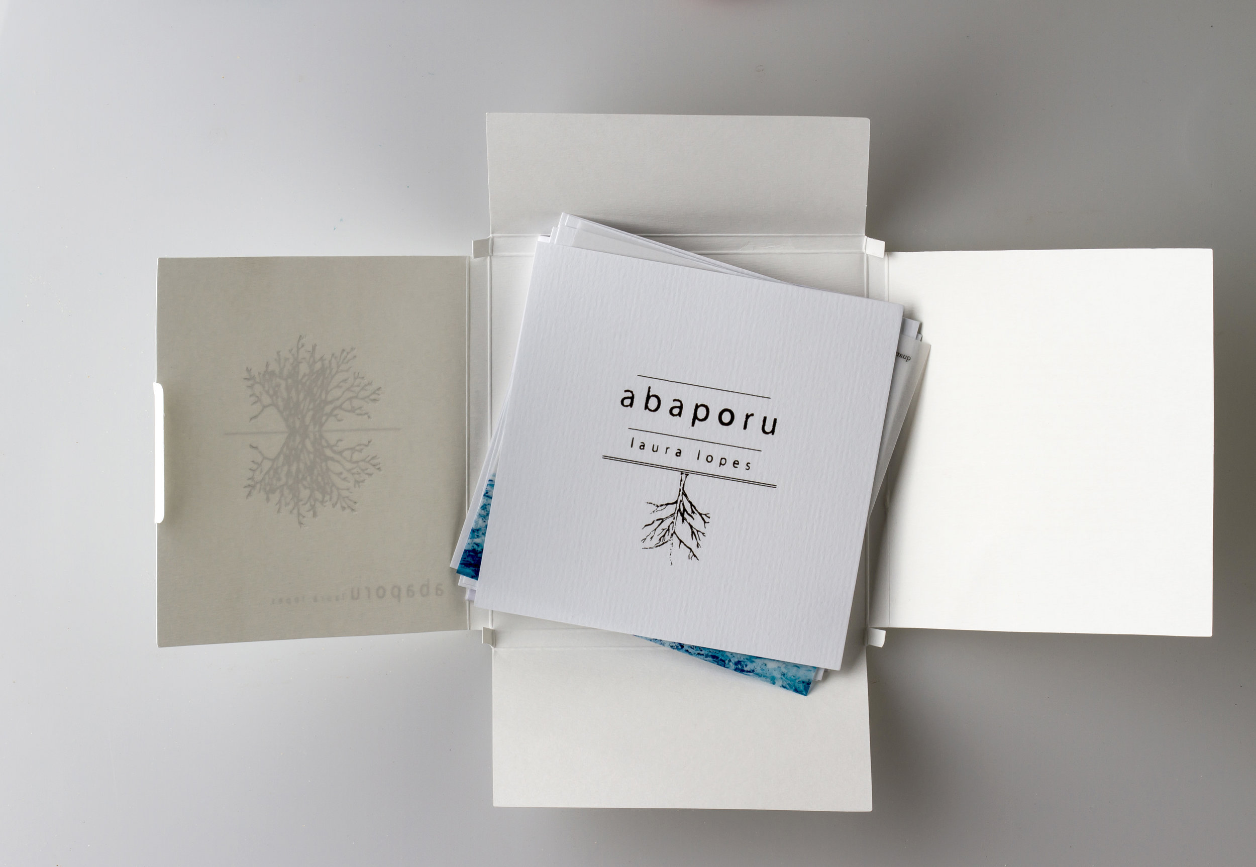
You write: “We develop visual identities, books and editorials, packaging and illustration, with a special focus on the cultural fields”. Why the cultural fields?
I think that has to do with our individual stories. During his first internship, Filipe was working as a designer for one of Brazil’s most important theatre groups named Grupo Galpão. Soon he had many friends and clients among the theatre people. As to myself, I even tried to abandon design and become an actor. The main reason for working for the cultural field is probably that we tend to create in an authorial and risky zone. We usually have the chance to be more experimental and to push the clients’ expectations a little bit further. I think it is very important for them to be perceived by the public in a more subtle way than the overall advertisement.
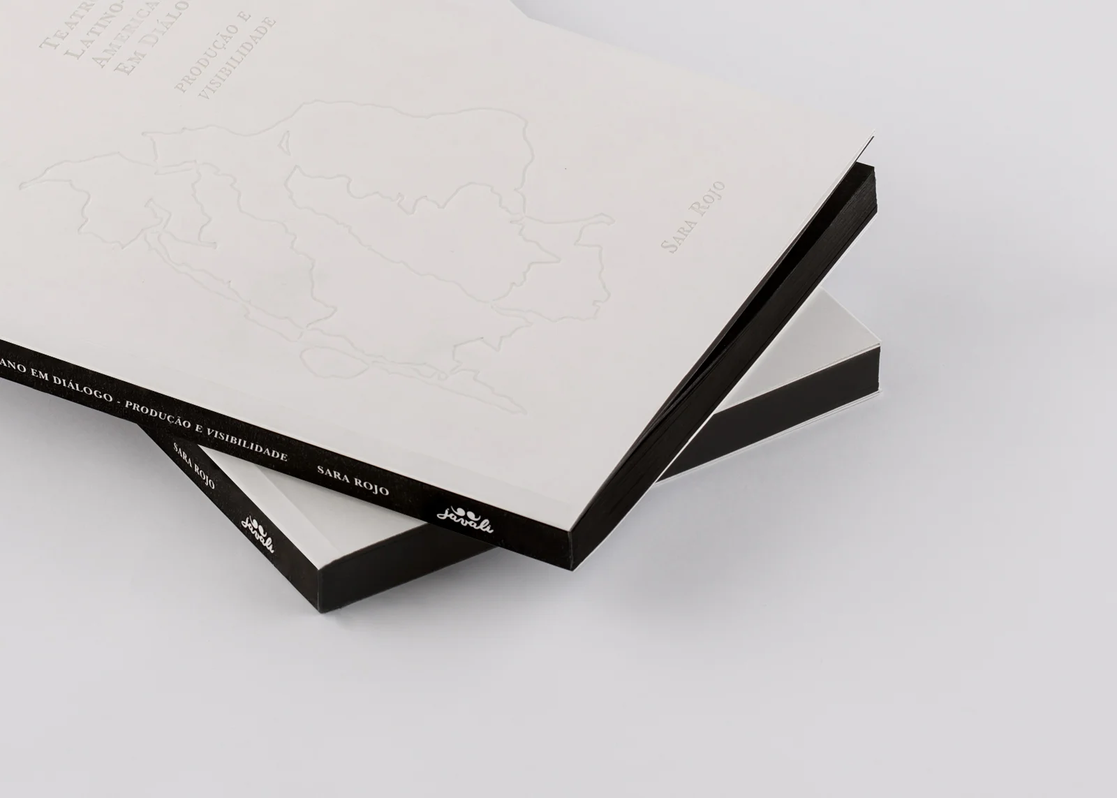
Teatro latino-americano: produção e visibilidade is an editorial design project for a book on Chilean history (years before the military coup, the period of Latin American dictatorship and neo-liberalism). You write: “One of the challenges while designing the book was to translate in a graphical way the concepts used by the author to think [about] the theatre and politics in Latin America.” Art in general can be very political, a form of activism. I’m wondering if you have such a desire to reflect upon political, social, societal or economic issues with your art just by accepting a work like this, for instance.
We definitely want to be perceived this way. Any work that doesn’t reflect its time is probably very shallow. We design images and messages that will circulate in a very conflicting world. It is always a challenge to understand how to use projects to convey a certain level of provocation.
When exploring your Behance profile I noticed that you describe almost every project in more detail. Why do you think it’s important to write a description for each project of yours?
I think the best of our projects is the thinking behind it — it wouldn’t make any sense to show the images and suppress their context. What interest us the most is to explore the intricate relations between images, design, culture and communication. We want to use design as a tool or a platform to affect people or to disturb them in a — positive and creative — way.
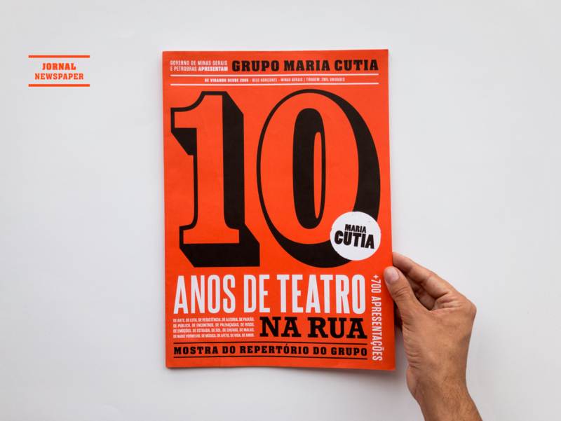
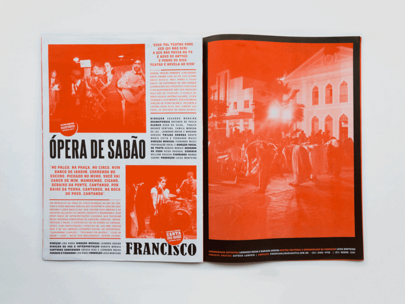
While elaborating on the design for 10 Anos | Grupo Maria Cutia, you explain, “we explored vibrant colours and diverse types, creating a texture of typography as in the popular urban posters”. What criteria do you follow when choosing a font?
No specific criteria at all, just the general aspects of composition. We are definitely NOT type experts.
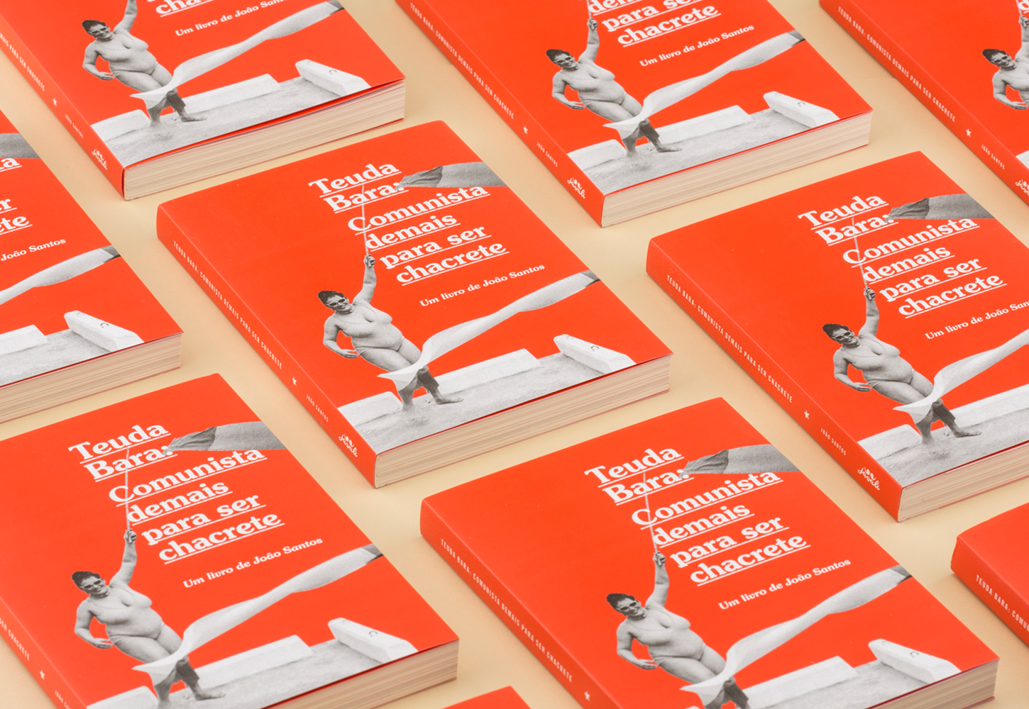
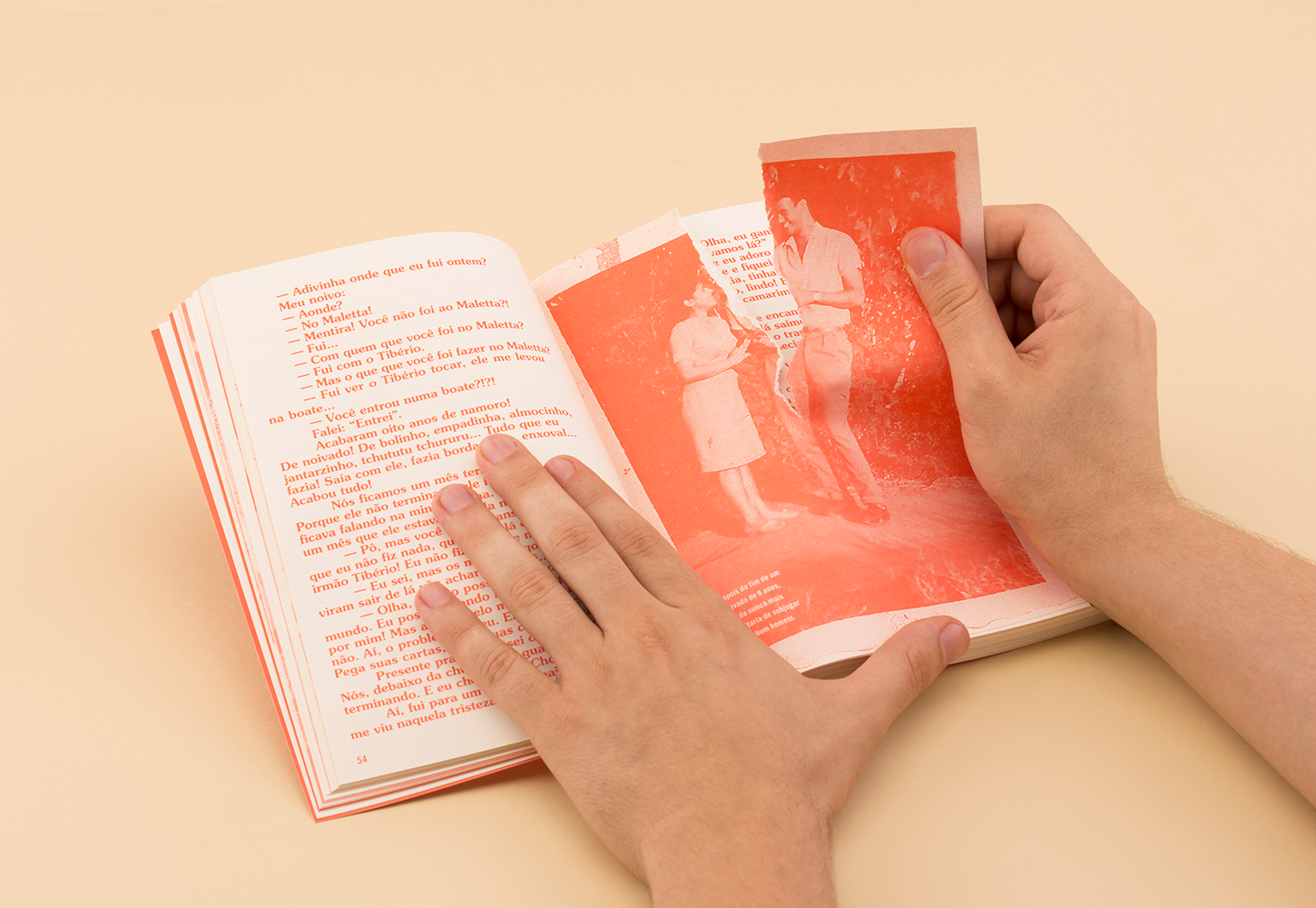
You’ve realised projects in both black-and-white (such as the book mentioned above) and colours. When it comes to colours, those hit us at once. How do you decide on which direction you should go with the project in terms of shades and tones?
Generally speaking, when we are designing book, there is always a budget restriction when it comes to printing. That usually forces us to use colours smartly. Of course, in any other situation colour is also an expressive tool, but we don’t really have a method for that. We try to convey feelings and symbolism in the best way of keeping the client’s budget and needs in mind.

I’d say almost all of your works are based on a simple idea and rather minimalist, however, the result is always somewhat unexpected or even extraordinary. Walk us through the design process!
We usually start by having a very detailed briefing meeting with the client. Sometimes some idea already comes up, but most times we get together later, the three of us, in the studio and brainstorm. We’ve actually created seven creative mantras that we try to keep in mind at this point. Overall, we try to understand what the client expects from us, and what would be the exact opposite of that. In addition to that, we usually aim at pinching a crystal clear concept behind the whole thing. Will it be all about the materials used or will we use a more iconoclastic approach? We usually try to create something that can’t be ignored and that has some kind of clever twist to it. And we always make A LOT of variations for everything. A LOT.

You’ve realised projects in both black-and-white (such as the book mentioned above) and colours. When it comes to colours, those hit us at once. How do you decide on which direction you should go with the project in terms of shades and tones?
Generally speaking, when we are designing book, there is always a budget restriction when it comes to printing. That usually forces us to use colours smartly. Of course, in any other situation colour is also an expressive tool, but we don’t really have a method for that. We try to convey feelings and symbolism in the best way of keeping the client’s budget and needs in mind.
You participated in the ING Creatives Festival in Dubai. How did you prepare for that?
We worked like two psychopaths to have everything ready on time. We had been editing our portfolio in the past three years (that actually looks more like a crazy magazine), and we also made a lot of small products to treat the folks in Dubai.
What happens now?
We are working on a new book, an anthology of theatre plays. Oh, and we are also working on our first 100% authorial art project that will be released in June!
What are your plans and goals?
This is the million-dollar question! We want to be recognised as an authentic creative studio that designs valuable concepts and develops relevant projects, especially in the arts. We certainly want to have more and more time to invest in our own artistic projects, although we obviously love designing books, music album covers and film and theatre posters. We are very promiscuous in design, so we always adventure ourselves in new projects.