Typography, Illustration, and Lettering
An Interview with Lettering Artist & Graphic Designer Tamara Arkatova
Tamara has worked full-time as a graphic designer with various art and cultural institutions, but today she’s getting more immersed in lettering where her passion for typography and illustration can manifest. I’ve asked Tamara about her student and freelance years, Russian design, Cyrillic and Latin scripts, and some of her personal projects.

Tamara Arkatova
Let’s start with your educational background. You studied graphic design and lettering in Russia. What approaches and traditions do schools in Russia follow?
In my opinion, Russian schools are still focused too much on traditional drawing and oil painting. When I studied at the local art school (in Voronezh), I was pretty much taught within this paradigm, and partly because of that I didn’t think about becoming a graphic designer. I simply didn’t see any point in being a designer. There were no designers among teachers, and the city itself was not really full of examples of good design. Then, after graduation, I moved to Moscow and attended the British Higher School of Art and Design (BHSAD), which follows a completely different approach to studying design. That helped me discover a lot of new things: new ways of thinking, new creative fields, and new surroundings.
Thinking about the different fields of the arts, we can really say that Russia has a long history of artistic excellence. What are your thoughts on the contemporary art and design scene?
We have great artists and designers, what we don’t have is a community. The situation is changing rapidly, though, due to new schools and universities, such as the BHSAD, the Strelka Institute for Media, Architecture and Design, the Higher School of Economics (HSE), Baza (Base in English), etc. Unfortunately, all of these new and cool places are situated in Moscow, and the rest of the country is kind of abandoned in terms of design education. I do hope that the more creative people will graduate from these schools, the more it will influence the art and design scene, even in Siberia.
What position do you think Russian design holds in the context of Europe, Asia and in the world?
Russia is not a country of design like the Netherlands, Finland, or Great Britain. We are somewhere between Europe and Asia, not only geographically but also culturally, which impacts our design as well. Russian designers are good when it comes to creating ideas, but the execution of them, and especially the visual parts of graphic design, is not their strongest side. Also, due to our history and the period when Russia was cut from the rest of the world, Russian designers used to look too much into the past for inspiration instead of looking around them.
What are some of the challenges and opportunities designers in Russia have?
Challenges and opportunities both lie in the same area. We have big gaps to fill, for instance in type design. While graphic designers suffer from the lack of good and diverse Cyrillic typefaces, type designers are strongly needed. European type designers might be stressed because of the intense competition within the industry, but we don’t have this problem yet, I guess. Another big challenge is that the value of design in our society is still not really high, and this heavily influences how much money we can charge our clients. For example, an average designer’s fee for a book cover is something between $100 and $200. Of course, in IT, you’ll get a competitive salary, but not everyone wants to be a UX designer, or work in IT for that matter.
You’ve mentioned that schools are concentrated in Moscow, but there are other major cities in Russia. I’m wondering what artistic or design networks connect artists and designers in the country.
I guess we use the Internet and social media for that purpose just like everybody else in the world. Also, big events like festivals and forums can help local designers meet in person, and even boost collaboration. I personally like Typomania and Design Prosmotr.
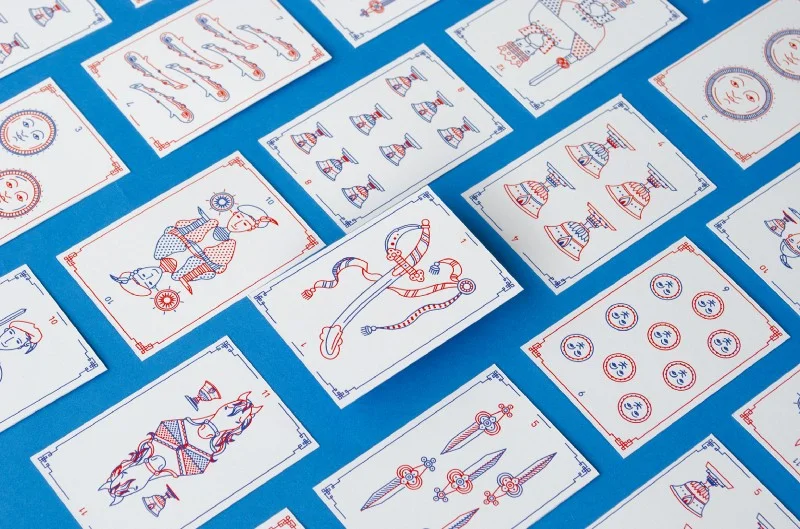
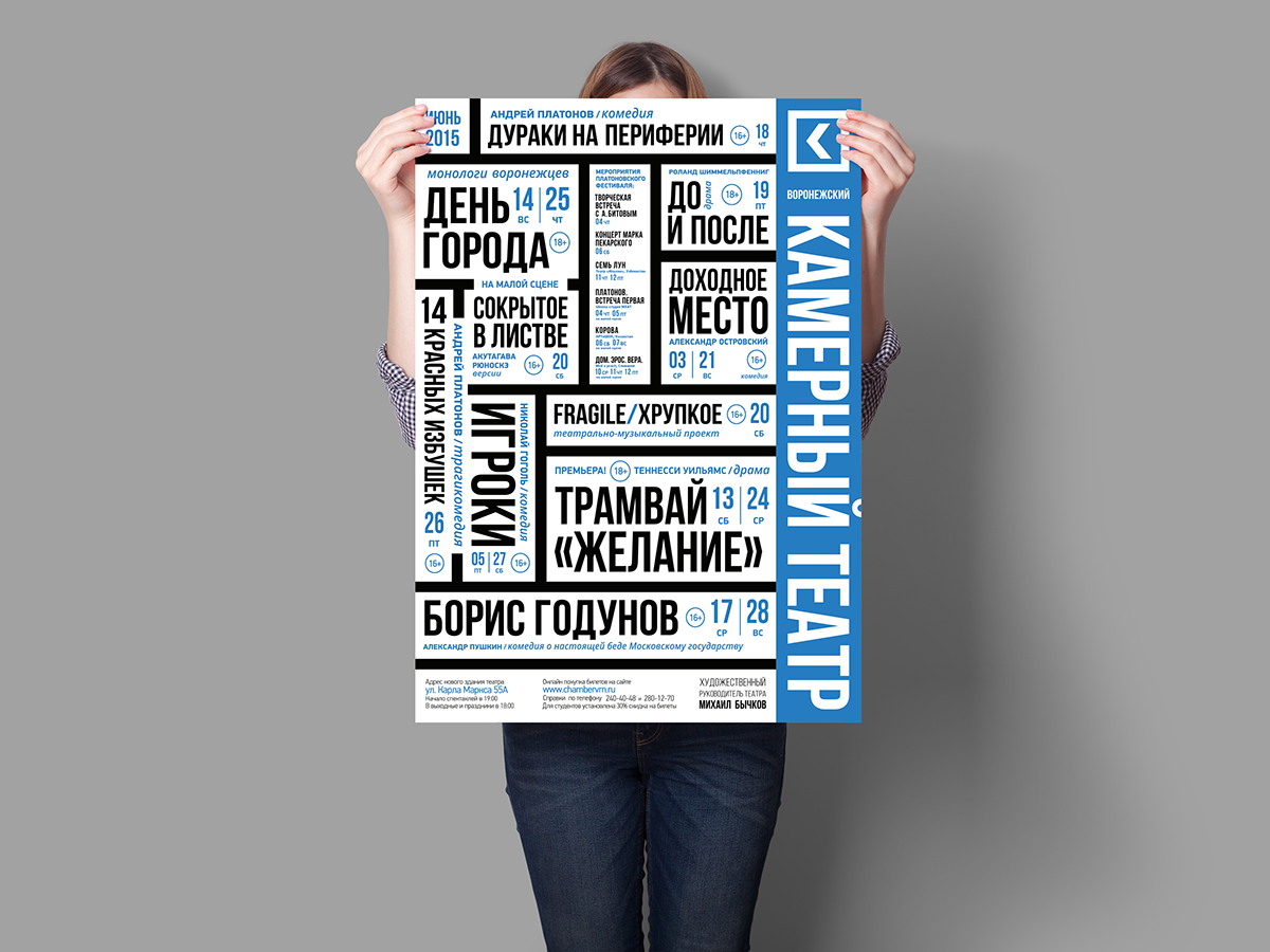
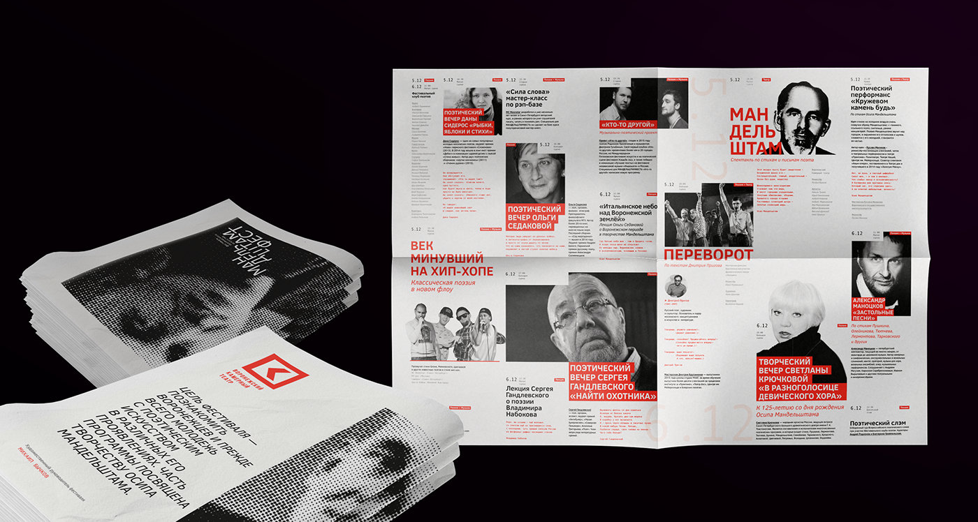
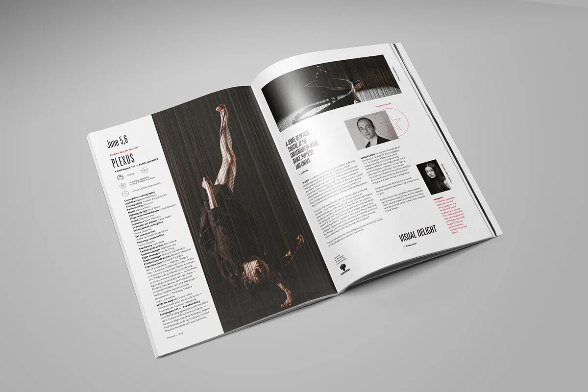
Since finishing school, you’ve worked on editorial design projects for cultural and art institutions such as theatres, festivals producing lots of posters, booklets, postcards, logos, etc. What led you to the world of art and culture?
It was a pure coincidence. I finished a course in media design, I was looking for a job, and I saw that my favourite theatre (Voronezh Chamber Theatre) was hiring a designer. The theatre and the famous Russian Platonov Arts Festival are run by the same art director, so I ended up working for both of these institutions. And the more you work with theatres, the more theatres ask you to work for them. In the end, working with theatres was too exhausting for me because creative but powerful people were trying to dominate instead of collaborating.
You explained somewhere online that you had chosen to focus more on lettering and make your work more specific. How did you arrive at this decision?
I got tired of designing. Initially, I wanted to be an illustrator but I thought that was not a real job and studied editorial design instead to have a regular design job later on. I chose this particular design field because I fell in love with typography prior to my studies. I thought it would be great if I could deal with both illustrations and typography, thus creating books from scratch on my own. But, instead of making books, I worked as a full-time graphic designer and was designing identities, posters and booklets. I felt I was missing the illustration part. In lettering, I can combine typography and illustration. This has made me realise that I don’t necessarily need to create books to be an illustrator and I don’t have to completely give up graphic design either.
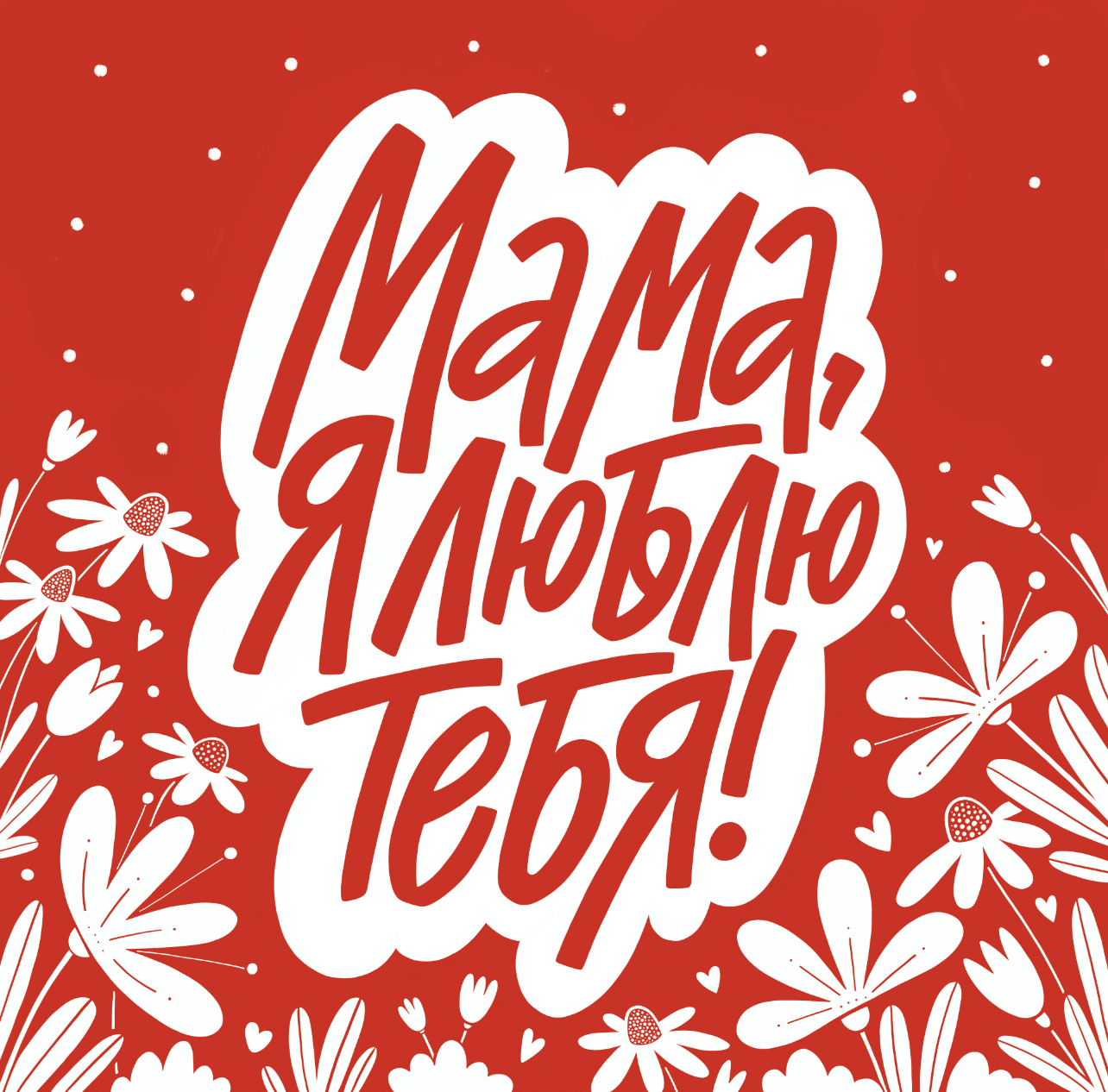
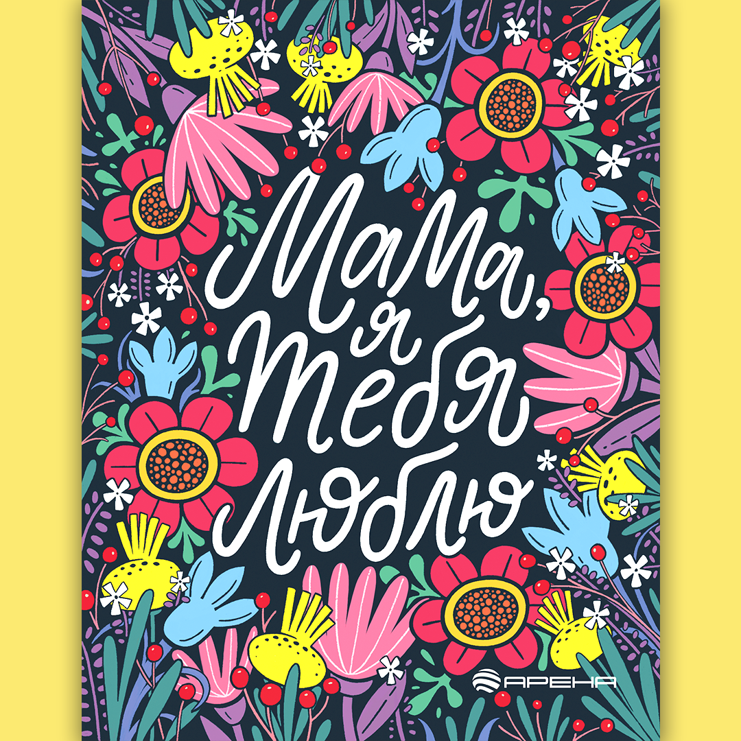
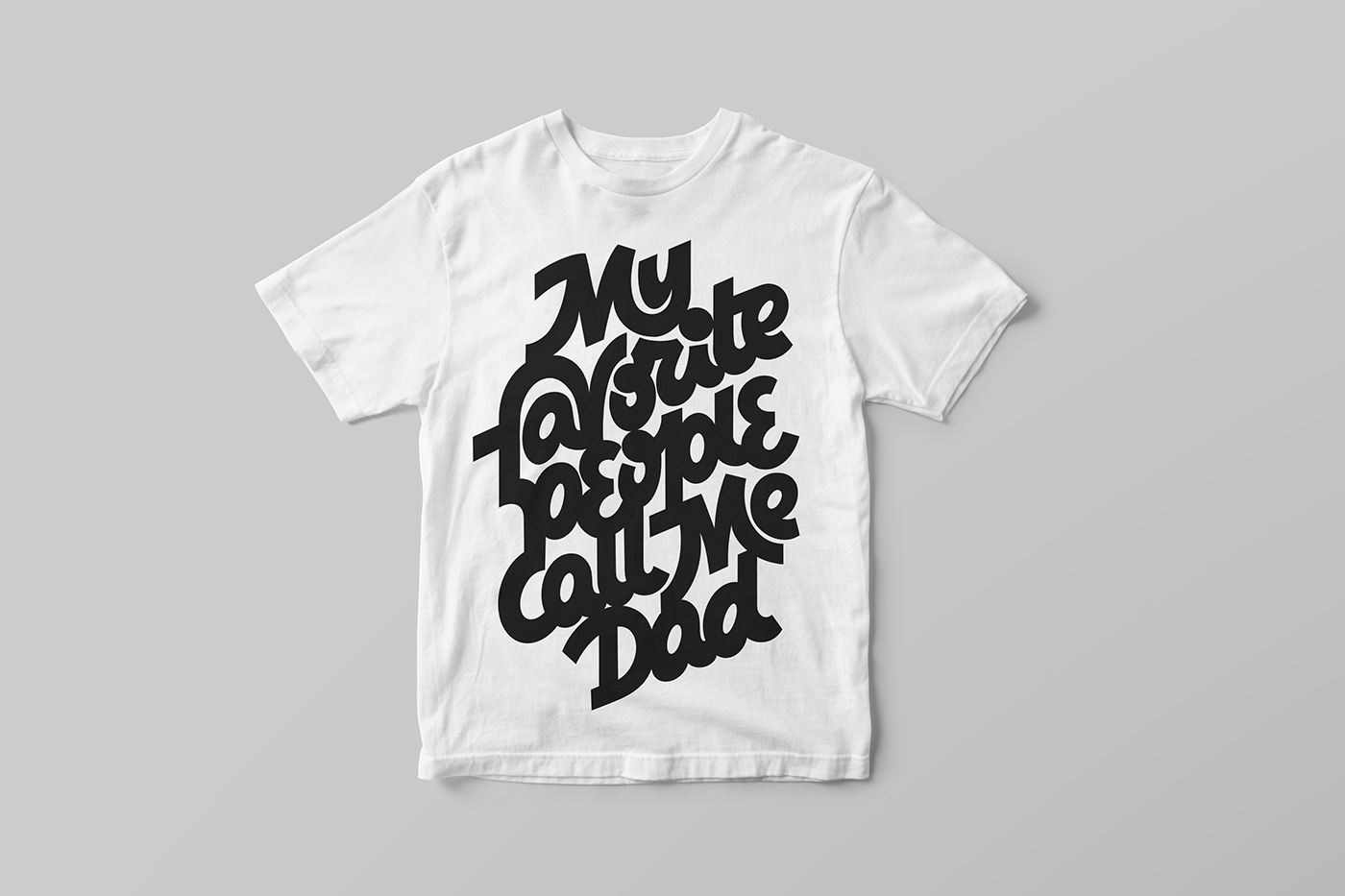
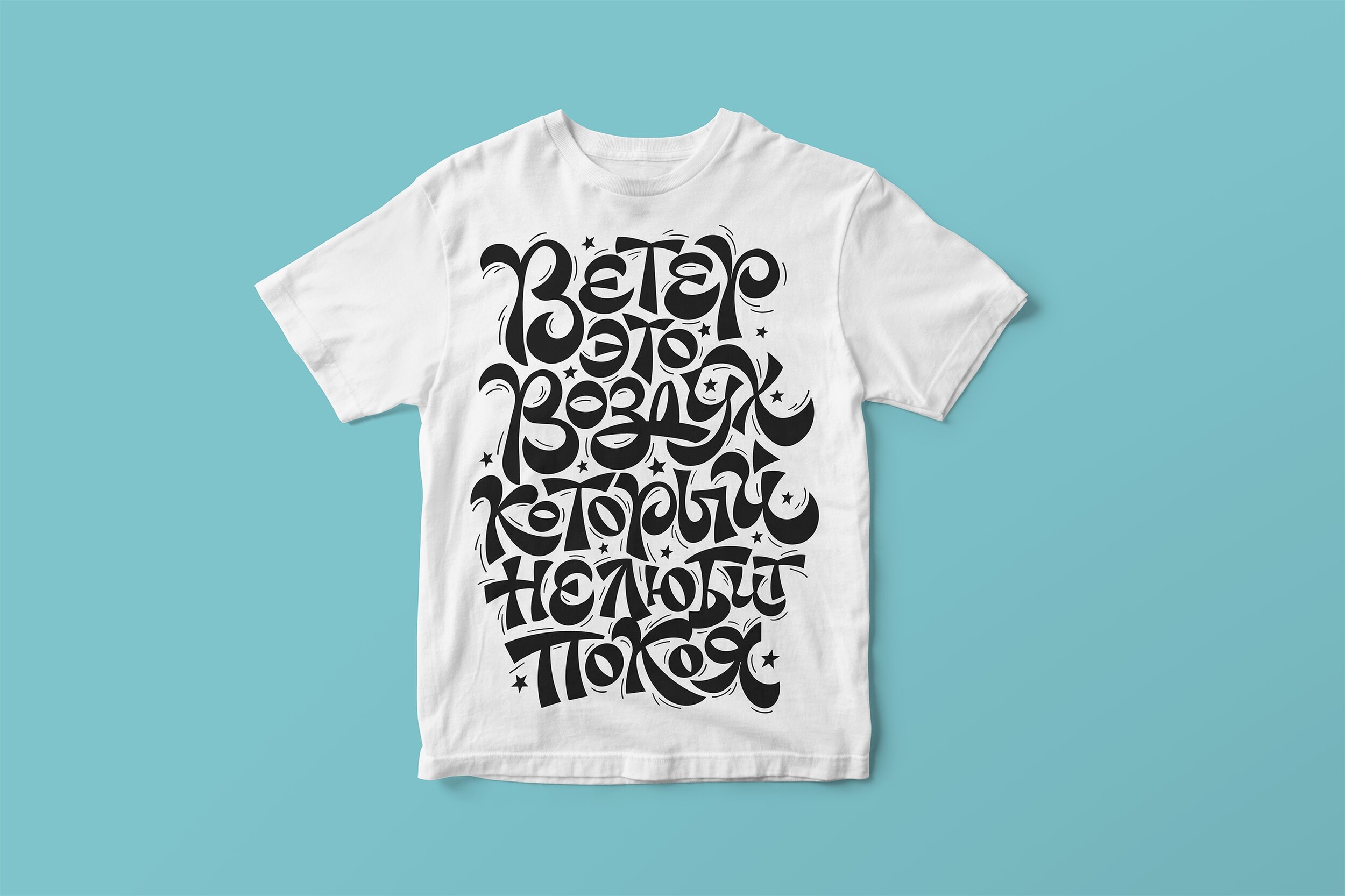
As a lettering artist, you produce texts using both the Cyrillic and Latin script. What do you need to keep in mind when working on a project writing in Cyrillic or Latin letters? Is there any specificity that you would pay more attention to when using one or the other?
When working with Cyrillic letters, you always deal with longer words, which always affects the composition. It’s especially hard when you have to create similar captions in both scripts. But I don’t like all these common complaints about the Cyrillic alphabet in comparison to the Latin one. Designers usually say something like Latin letters being more beautiful or convenient to use but none of these designers compares Cyrillic to Chinese or Arabic.

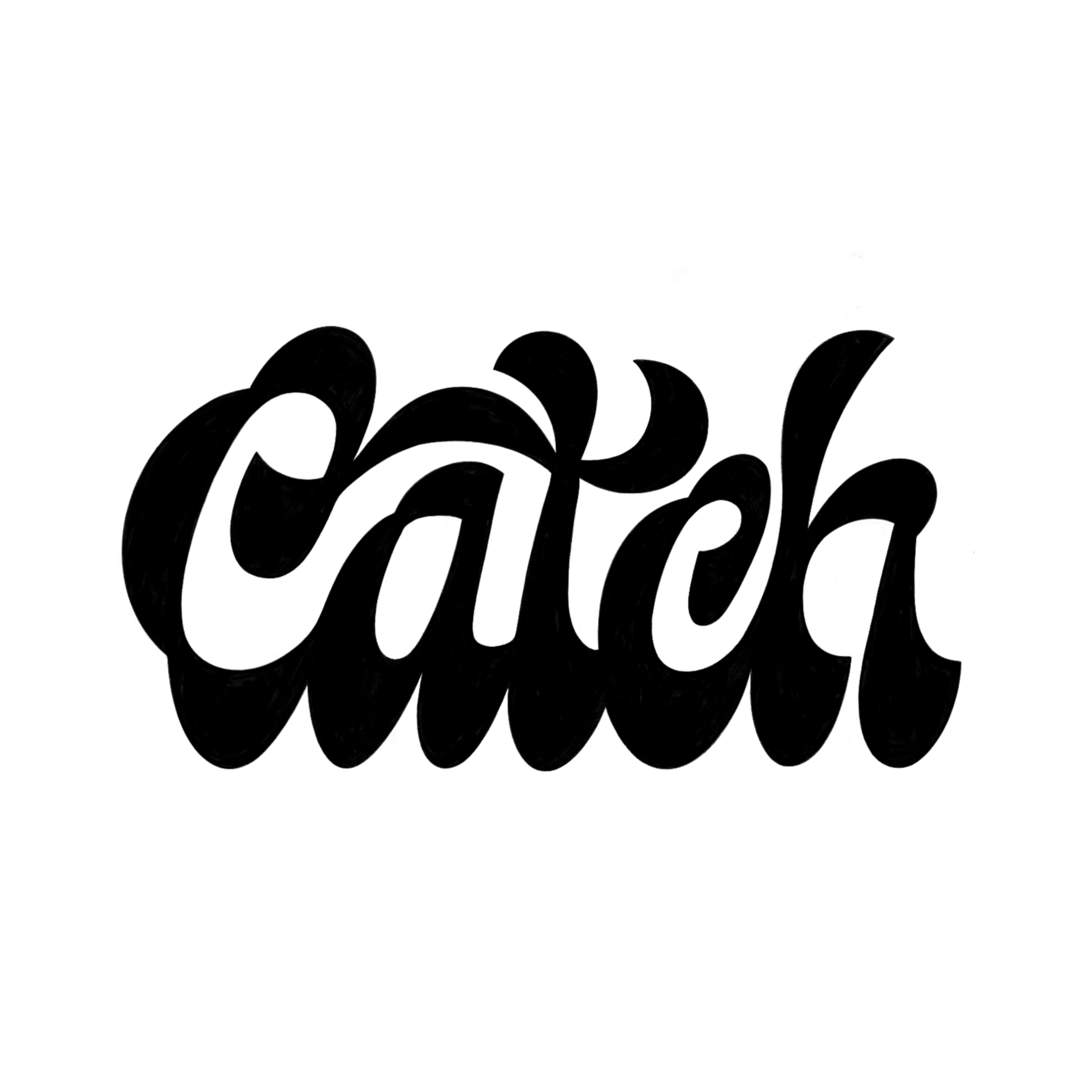
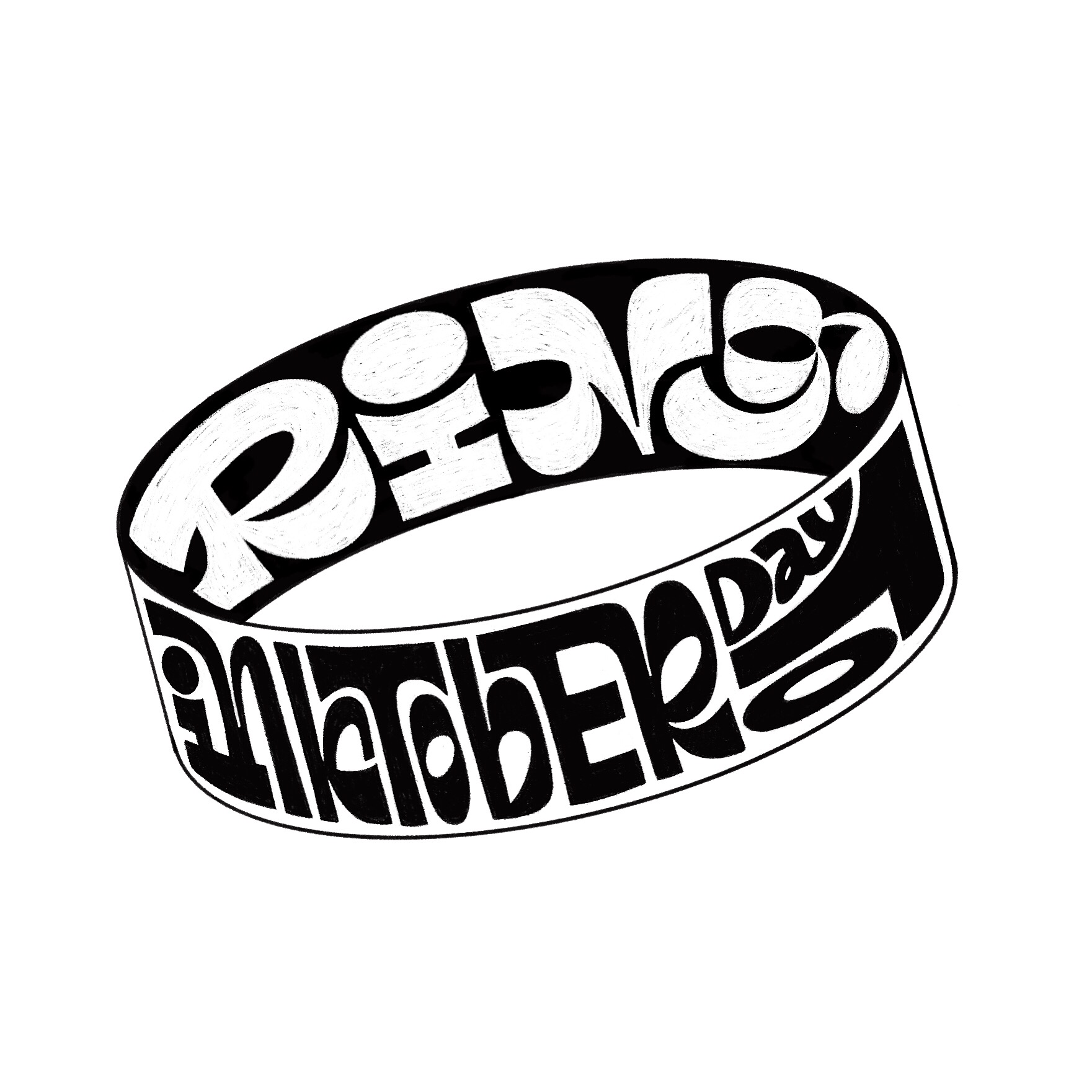
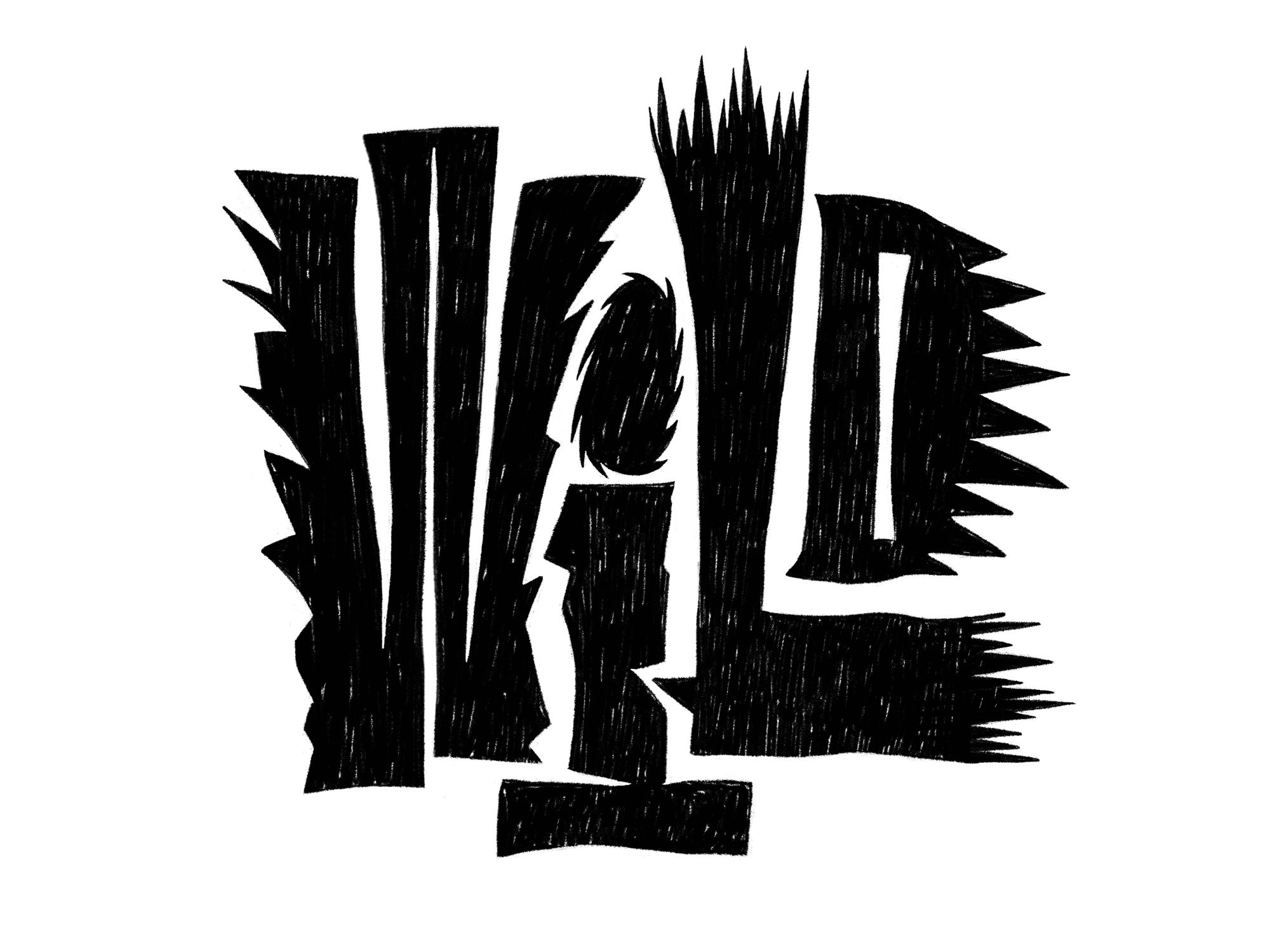
Moving on to your your projects… 100 Days of Lettering must have been demanding and rewarding at the same time. You write on Behance that you wanted to experiment with letterforms more. I’m curious about your approach to the words, phrases, and sentences written. Did you have a theme in mind or would you say you improvised a lot?
The project was indeed challenging… I needed to follow one simple rule, namely not to draw for too long. One should spend one-two hours working on a piece – just to practise. In the beginning, it was hard to make something good in such a short period of time, and I wasn’t really happy about the idea of posting rough sketches. But, in a week or two, I got used to it. Maybe my brain started to work better.
As for themes and phrases, I can say that I never have a plan, which is not that great, so I’m currently working on it to change that. During the challenge, every day started with a blank sheet of paper and the necessity to write something. Sometimes I had a trigger, like a desire to make something in a particular shape or style, sometimes the theme or the style was the result of the circumstances. Once I didn’t have my iPad with me, so I was just drawing in my sketchbook. I also decided to make it even more inconvenient and started drawing with my left hand. After that, I used my left hand more for several other pieces to make my lettering more vivid with some rough edges and uneven lines.

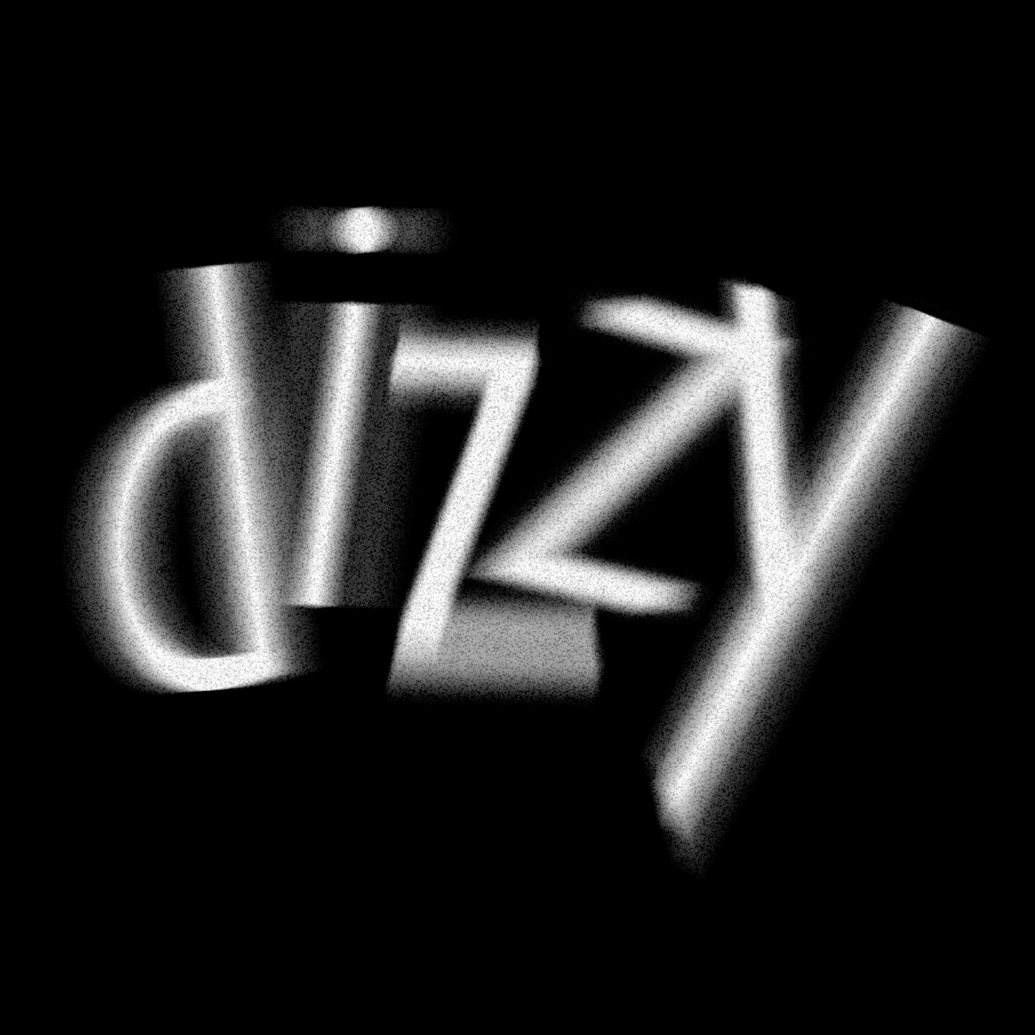
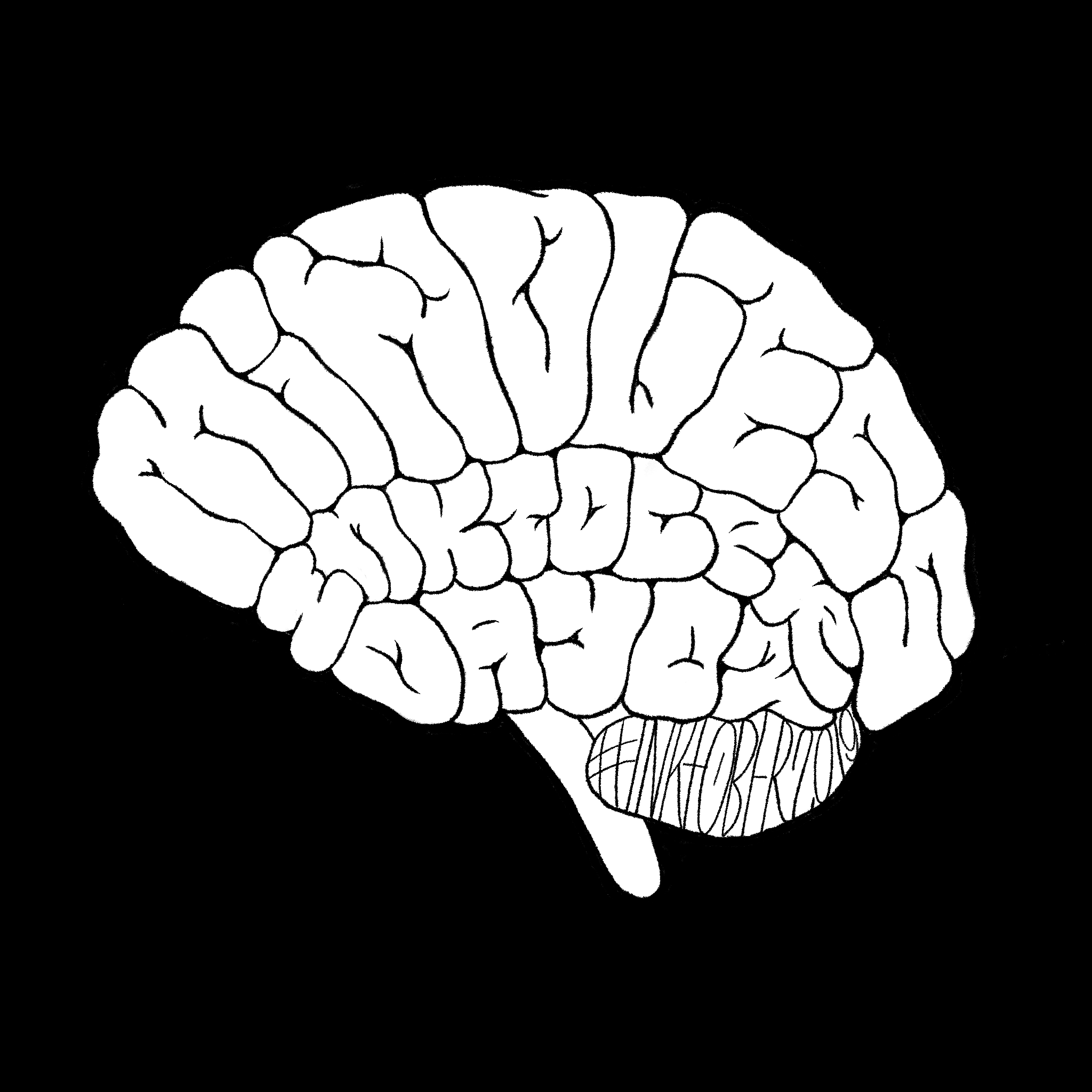
You also participated in 36 Days of Type & Inktober2019. What have these challenges taught you about lettering and/or yourself?
I like challenges, and these challenges are great! However, I must say that I found Inktober frustrating and 36 Days of Type supportive. I think it has to do with the communities. People participating in Inktober are mostly illustrators or CG artists, and being a letterer among them is a weird thing. I think none of them really understands why you’re doing it and none of them seems to be interested. For me, the whole point of participation in such challenges is to promote my work. In terms of this, Inktober is not helpful for me. On the other hand, it was interesting to use the official list of themes (for illustrations) as a brief. I tried to illustrate the themes with type and not simply write the words. Maybe that’s another reason why this challenge was more difficult than the other two. As for 36 Days of Type, I’d say that I’m in love with this challenge and can’t wait for the new edition. When drawing letters and competing with other designers, I’m motivated and I feel I’m in the right place.
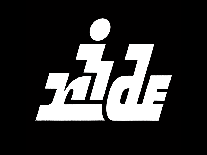
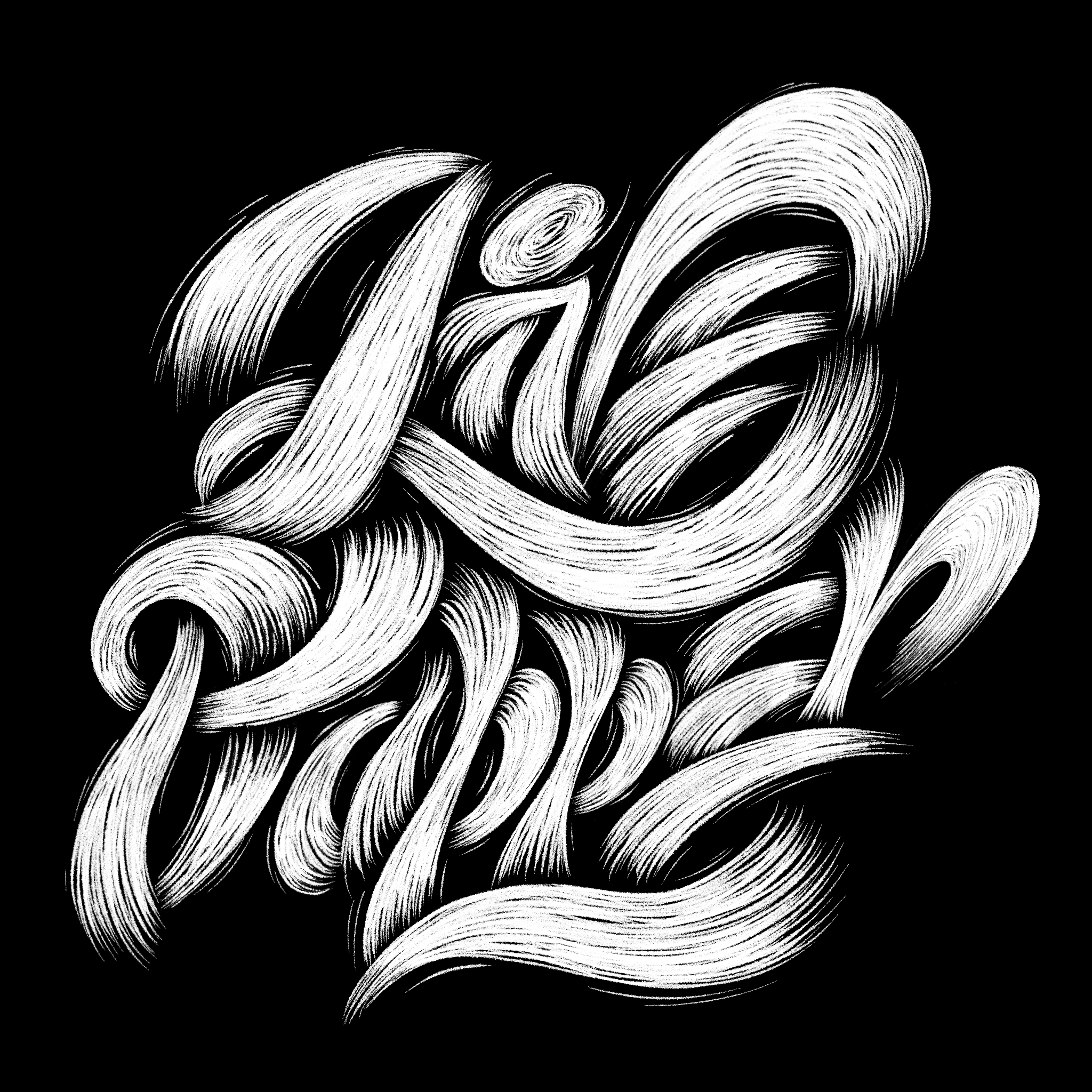
What kinds of lettering do you enjoy the most doing?
I think it’s evident from my Instagram feed that I’m obsessed with ligatures and making my lettering perfectly fit any shape. The most challenging for me is to create script lettering. Maybe, in a year or two, as the result of gaining more experience, my preferences will be quite the opposite.
Projects like these require a level of motivation and inspiration. How do you manage creative blocks?
Seven months of Instagram challenges, when I was in the position of posting almost every day, cured the disease called creative block. Because I got to know and prove it many times that appetite comes with eating. Unfortunately, there is still another problem called burnout.
Your projects also show that your creativity can easily manifest on toasts or using thread, jam, and other things. With what else do you want to do some lettering in the future?
I like to try embroidery! And I’d also like to make a series of work in analogue ways, especially using linocut and wood. Many artists draw sketches using traditional media, and then complete and refine their work digitally. I do quite the opposite.
You’re a freelancer so you need to deal with all aspects of your work, from promoting yourself and getting commissions to creating and managing your finances. What has been the trickiest part of working freelance?
Promoting myself still is the trickiest part. Another difficult thing is pricing. Yet creating an actual piece of art is the most pleasing and satisfying thing.
You actively share your content on various online platforms. What strategies, if any, do you pursue when publishing content?
At the moment I can’t really say that I have any particular strategy. I’ve been just focusing on experimenting with letterforms. However, as my New Year’s resolution, I’d like to start developing my artistic strategy and my artistic voice.
Aside from creating, you’ve started teaching (tutoring) at NOMOS College recently. What exactly do you do? What is the most rewarding part of being a tutor?
I always wanted to teach, since childhood, and this year it’s finally happened. For the moment, I’m teaching composition and also a brief course about design in general, aka introduction to design. I hope, next year or a bit later, I’ll be teaching typography. Surprisingly, the most rewarding part of teaching is that you finally get to structure all of your chaotic knowledge. Also, you’re constantly learning something new from your students.

What types of projects are you working on right now?
I continue working with some theatres, on their posters and other advertising, and I also make covers and logotypes occasionally. Luckily, I’ve started to get hired for projects related more to lettering and illustration. I’ve got a lot of personal projects in the making as well. I’ve even started to feel more like an artist than a designer, which is great.
What are your plans?
I’m going to release a couple of products, not sure yet what exactly they’ll be. As I’ve said previously, I’d rather do something analogue than digital. I’d like to pay more attention to Cyrillic lettering, and I might learn Vyaz calligraphy. I’m also thinking about opening a studio space outside my apartment because the more traditional media my work involves, the more space I need.