On Creativity, Innovation and Courage
An Interview with Cuban Graphic Designer Alberto (Tinti) Nodarse
Cuba is truly a mysterious place for those who have never been there. You hear stories from the news, from your friends, but the mystery is still there. As Cuban graphic designer Alberto (Tinti) Nodarse says, “Cuba has several faces. It all depends on whom you ask.” So I asked Tinti to learn about his Cuba. He talked about his experience working as a creative professional on the island and gave some insights into Cuban design traditions.
Let’s start with a very basic question. How did you land in the field of graphic design, illustration and typography?
I always wanted to do what I do today. When I was a child I used to paint a lot— on walls and sidewalks. Afterwards, with the adolescence, I stopped painting, and I had very few expectations of me finding a career in something else than engineering. However, one day my mum told me about the local university where one could study design. I became really excited, ran to her and said: “This is exactly what I want to do — to be a designer!”
So you’ve studied at the Instituto Superior de Diseño (Higher Institute of Design). Please briefly talk about your experience there. What would you say about your time there?
The time spent there was indeed an incredible experience. This is the only university with this profile in Cuba, so inside its classrooms there are students from all over the country. During my time there, between 2005 and 2010, the environment was great, and many passionate and hugely motivated young people were doing new things. Wherever you went, you could experience the creative vibe the school was able to offer — outside the classrooms and workshops as well. In each semester, I realized how much I had learnt and experimented, and how much I still needed to learn about the world. During those years, I had a truly amazing team of professors, who were really open to exchanging ideas, and willing to share their knowledge with us.
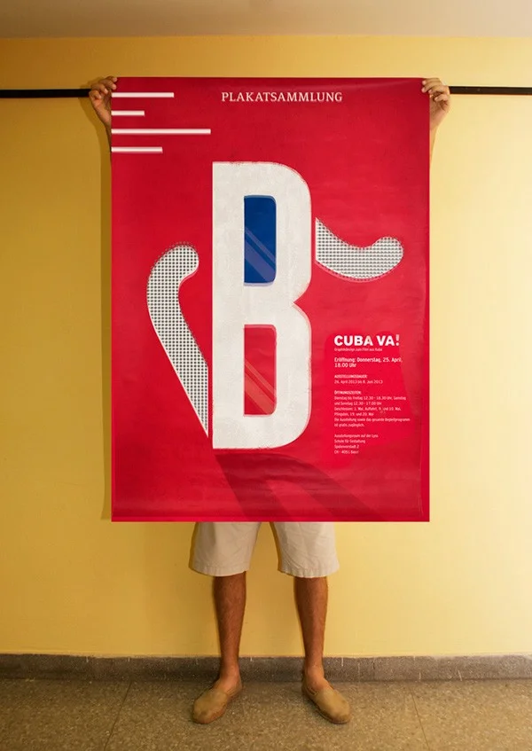
CUBA VA!
What kind of courses did you have?
The study plan has been designed based on many prestigious design schools’ curriculum, such as Bauhaus and Gestalt. During the first two years, I learnt the fundamentals of design, the theory of colours, perspectives, isometrics, etc. We did a lot of manual work. From the third year, students are divided into three groups. Some study industrial design, some costume and accessories design, and the rest graphic design. I specialised in graphic design. I had classes in illustration, typography, branding, marketing, web, multimedia, audiovisual, etc. Today they also focus on UX/UI and motion design with the rising of web 2.0 and social media sites.
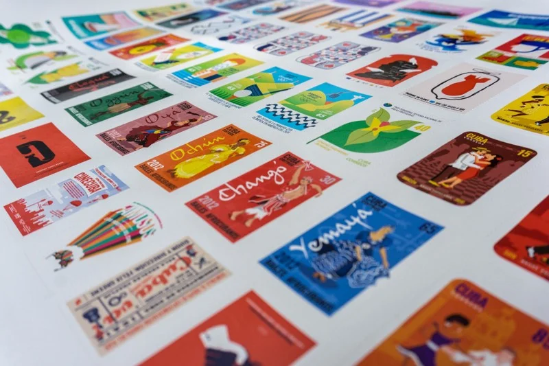
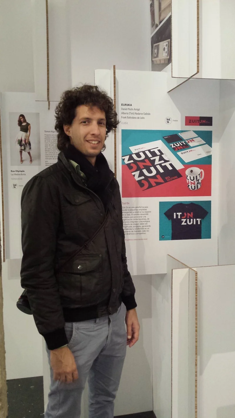
Stamp Postal Design | Pocket Posters | Eureka Creativos
Cuba is surely an incredible place. I’ve got the feeling that the general public knows so much about it, still, those are probably mostly stereotypes or sometimes speculations. How would you describe your Cuba?
Yes, many stereotypes are circulating in the world. So considering the huge amount of different experiences and opinions, I’d say Cuba has several faces, but you can at least differentiate between two Cubas; one that is projected to the world, and the other one that is experienced by people living on the island. Cuba is diverse and complex, with several contradictions harmonically co-existing. It is a mixture of light, colours, warmth, poetry, folklore, music, smiles and also tears, national pride and also apathy, religion and also atheism, movement and also immobility. I think we are a country of creative survivors: those who don’t reinvent themselves day by day are left behind.
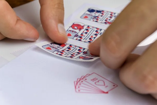
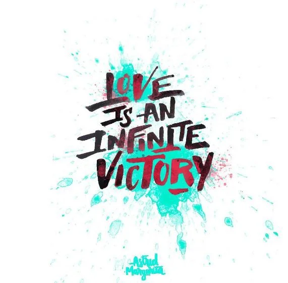
Rights in Love | Pocket Posters | Eureka Creativos
What should we all know about Cuban design, illustration and typography?
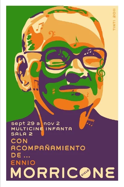
I think Cuban design needs more attention. What has been done and developed in the scene of design in Cuba should be visible to the world. Talented Cuban designers need to work using limited resources and need to overcome big challenges. They deserve more space and visibility, and definitely more support to be able to create. The most popular pieces of Cuban design are the cultural, social and political posters designed after the Cuban Revolution of 1959: the cultural posters by El Instituto Cubano de Arte e Industria Cinematográficos (ICAIC, Cuban Institute of Cinematographic Art and Industry) and Casa de las Américas, and the political posters by OSPAAAL (the Organization of Solidarity with the People of Asia, Africa and Latin America) in the journal named Tricontinental.

Cultural Posters
Related to the previous question. What position do you think Cuban design holds in the context of Central and South America and in the world?
I feel that design in the region still has more of a decorative role than a functional one. We, designers, need to educate clients and the general public about design. Although there are big companies working with Latin American creative groups (of designers), the local freelance designers’ work is still barely commissioned. It is a must to find a way to gain more power in the economic, social and political life of our own countries.
What do you think the biggest challenges and greatest opportunities designers working in the region have?
The region needs to be inclusive and promote an environment where ideas and creativity can thrive and be used to motivate social development. I would even say we should create our “Latin American Silicon Valley”. There are many possibilities in our countries due to the many problems we have to solve. Design can be definitely an innovative tool regarding solving those.
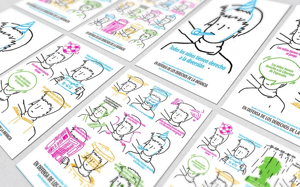
Children’s Rights
Connected to what you’ve just said. You’ve worked on projects related to fundamental human rights. What responsibilities do you think artists, designers, illustrators or other creative professionals have when it comes to addressing social, societal, economic or political issues?
Artists who address these kinds of issues must be honest and moral human beings first. Honesty and morality are essential for us if we want to reach out to the general public. After that, several ways of communicating these issues can be developed according to the client’s demand and flexibility, the designers’ creativity, and the resources available.
Besides being motivated to do good in society with your creativity, you’ve designed several film posters and album covers. Where is your interest in film and music coming from?
It is purely accidental. After graduation, I did an internship at ICAIC, which was a very dynamic and innovative place between 1960 and 1990. It was used to be the main centre for the development of graphic arts in Cuba. I had the opportunity to be one of the last people working with national poster development there. I’m very proud of that. That experience pushed me towards working with posters in general.
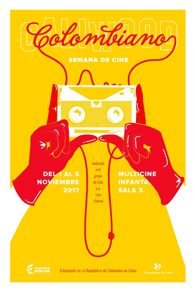
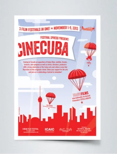
Semana de Cine Colombiano
Do you also listen to films or music while working or do you prefer complete silence?
I always listen to music while working. It creates a nice environment and boosts my creativity. I also watch several movies in my free time. I get a lot of inspiration from them as well.
What else inspires you?
Besides music, I find inspiration in people’s remarkable actions and attitudes observed in ordinary moments. These moments are usually barely noticeable. It is necessary to be very brave to do something meaningful, so you can actually make an impact. I find this type of trait valuable and encouraging.

Let’s talk about the actual design process now! What is it usually like?
First, I do research on the topic. If I’m not so familiar with it, I usually learn a lot at this stage. I also collect a wealth of visual information. Then I mix everything, and, from the interrelation of ideas, I start to draw on a piece of paper, with pencil, mixing concepts and elements. After that stage, I tend to go to the computer and add colours and the outline details. In the middle of the process, I usually exchange ideas with my colleagues, Frank Baltodano and Daniel Plutin. They give me feedback and some pieces of advice.
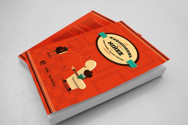
Book | Audiovisual and Childhood
It seems yellow has a special place in your heart. How do you decide on the colour being used for a particular project?
The colour is usually associated with the image of the institution or the client I work for. You can see, for instance, that several things related to Colombia are yellow. This is the Colombian national colour, and they want it to have a dominant role in the graphics. While working for the First European Film Festival in Cuba, we also worked a lot with yellow and blue. It was kind of obvious, as those are the colours of the flag of the European Union. In addition to that, we also used that colour in other projects — maybe because it is a pretty bright colour. I find a lot of yellow in Cuba, too.
Print or digital?
Both, although I have done more print than digital design. I believe that both are interesting, with their own advantages and limitations. It is necessary to know how to get the maximum from each of them.

Book | Cocinando en la Tradición
On Behance, we can find a few projects that the result of teamwork. What aspects of teamwork do/don’t you like?
It is always great to work in a team. So many ideas can emerge while discussing different projects. The difficult part is to dismiss some of them, those that lead us nowhere and choose the right one to develop. Creative professionals are often very tied to their own ideas, if those were their babies. It can be really difficult to let them go even when you are exposed to new ideas that seem much better and more suitable for the project. I fight my and my colleagues’ ego day after day because of this. But I think we handle the situation pretty well, probably because we are good friends, too.
Which project of yours are you the proudest of, and why?
I usually proud of my posters, I would only change them a little. I’m also happy about the projects I have developed in the group. It’s always great to build something by hand, too.

Brochure | Homenja a Gian Maria Volonte
What have you worked on right recently?
On the website of our studio named Eureka Creativos, with my colleagues, Frank Baltodano, Daniel Plutin and Yesey Perez. We worked together several times in the past, and not a long time ago we joined forces and founded our studio. We are very motivated and want to focus on what we love — to have a positive impact on people’s life.
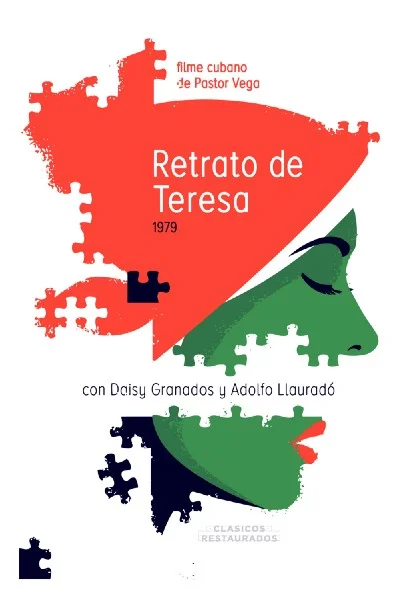
Recently I was also involved in a project for developing posters for restored Latin American film classics. The project is called CartelON and led by Yumey Besú and Sara Vega. I worked together with 14 Cuban designers and presented the posters at the Festival Internacional del Nuevo Cine Latinoamericano in December 2017.
What are your plans?
Keep working, working and working even more. As Spanish musician Joan Manuel Serrat sings: “Caminante, no hay camino, se hace camino al andar” (In English: “Wayfarer, there is no way. Make your way by going farther.”[1])
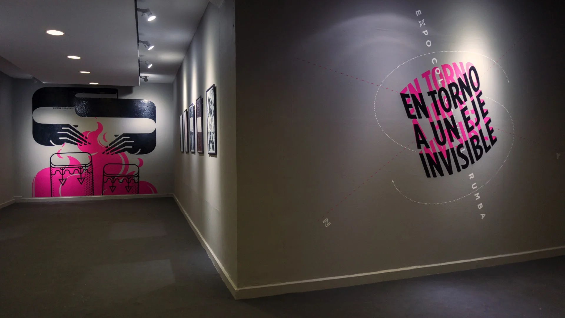
Expo La Rumba | Eureka Creativos
[1] Translated by using the poem Caminante no hay Camino (Wayfarer, there is no path) by Spanish poet Antonio Machado. http://www.ttischool.com/blog/poem-week-caminante-no-hay-camino-antonio-machados-translation/