Handwriting & Typefaces
TYPO Berlin: An Interview with Type Designer & Philologist Julia Sysmäläinen
Julia Sysmäläinen has a background in philology and design, and today she likes to combine these two fields, and often designs typefaces inspired by the handwriting of personalities from the literary scene. If you have ever grabbed a NIVEA product from the shelves of a supermarket, you might have already seen her work. I talked to Julia at TYPO Berlin in May 2018.
You started with philology and then turned to (type) design. How did this happen?
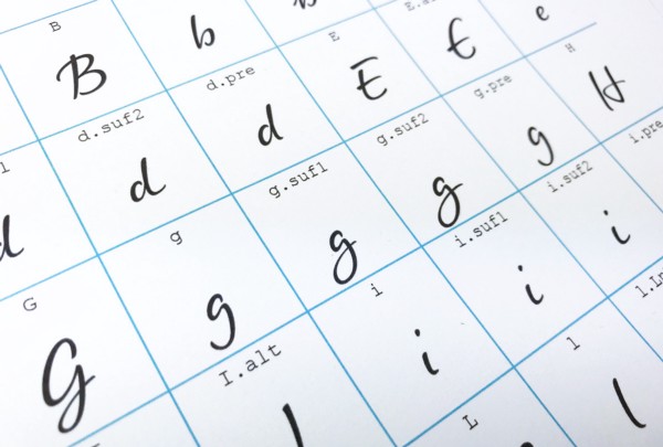
While studying literature, I was also working with the manuscripts of different writers. I got intrigued by their handwriting, because compared to the printed editions, handwritten sources can tell you much more about an author. When I embarked on the journey to create my typeface family Mister K, which is based on Franz Kafka’s handwriting, I examined just about all of his manuscripts, diaries and letters publicly available. These documents show differences in Kafka’s handwriting dependent on his age, the kind of text he was writing, and his momentary personal situation and mood. Since I couldn’t include all of these differences in just one typeface, Mister K became a whole family of script fonts. Most of them cover an extended Latin and Cyrillic character set.

Julia Sysmäläinen | Photo by Jürgen Sanides
What other authors’ handwriting have you worked with?
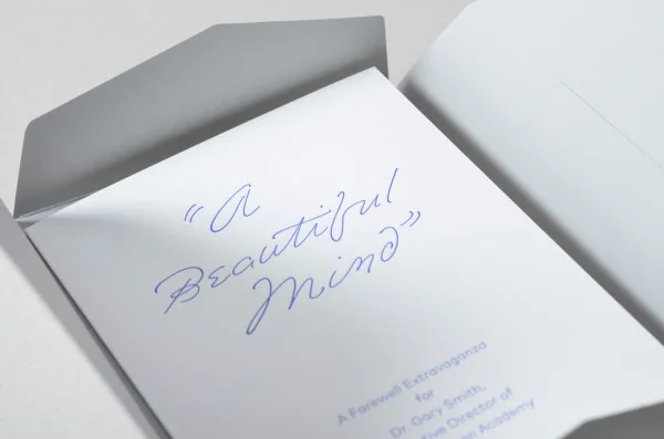
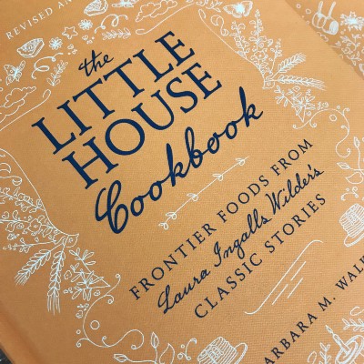
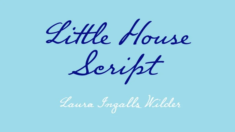
A few years ago, I worked on a project related to Laura Ingalls Wilder, the American writer known for her famous Little House novels — a typeface based on her handwriting was commissioned by HarperCollins Publishers in New York. They re-published many of her books and gave them a new visual outfit. My Little House Script was a part of this.
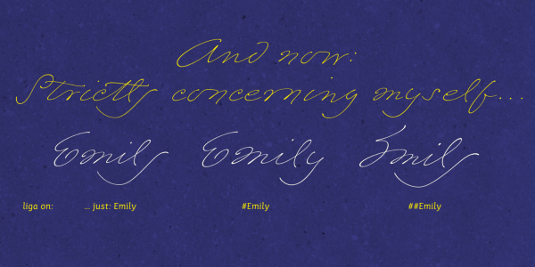
I’d say Wilder’s and Kafka’s handwriting differ in many ways. Roughly put, Kafka’s style is more impulsive and his letterforms are more unconventional, while Laura’s writing is more structured, her letters are well aligned and almost always connected. I also made a font named Emily In White based on American lyricist’s Emily Dickinson handwriting. Again, her style is quite different, almost extravagant; in her days, it was compared to bird tracks.
Are you planning to design another typeface based on someone’s handwriting?
There is a lot of work in progress, but too early to talk about it.
Images: Emily In White

You mentioned you were thoroughly examining the documents Kafka wrote. Do you always do a lot of research before the design process starts?
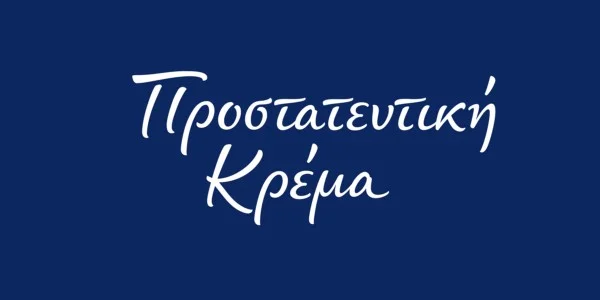
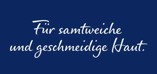
Of course. Being a philologist, the content of a writer’s texts is equally important to me as their visual appearance. If their content and literary quality didn’t convince me, I wouldn’t think of using them as a source for a typeface. So there is always research going on: before I begin with the design work, and it continues while I am doing it. What I presented here at TYPO Berlin is not based on a writer’s handwriting. This time the job was more like visualising a fictional personality as a script font. For NIVEA Care Type, we created a brand persona named NIVEA Woman and tried to reflect her character features in the typeface.
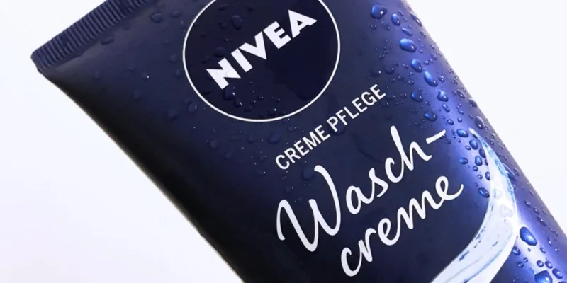
NIVEA Care Type
How much time do you usually need to finish a typeface?
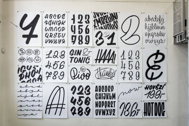
It depends on the typeface itself: how many languages I need to work with, and on the OpenType features included. Remember that OpenType coding can be 50 per cent of the overall work. Wilder’s handwriting was easy to work with, and it took me approximately four months to finish the font. On the other hand, I needed over two years to finalise the Regular style of the Mister K Family. Little House Script has about 700 glyphs, and, in comparison, Mister K Regular has 2,000 glyphs, just Latin characters, alternates and ligatures. Of course, deadlines can limit you as well. When I work on a personal project, I’m not in a rush, so I take my time. When I work for a customer, there is usually a deadline set. To be able to meet that, one must fully concentrate on only one project and lay everything else aside.
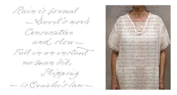
Images: Little House Script | Cover by Jenna Stempel, HarperCollins Publishers
Which alphabet is the most difficult to work with?
I’d not say one of them is more difficult than the other. When it comes to handwriting, I mostly work with the Latin and Cyrillic script, sometimes with Greek. The Cyrillic script has a number of different alphabets, for instance Bulgarian is different from Russian. If the typeface is meant to be used for languages with different alphabets, it’s better to work with them simultaneously.
You’ve mentioned the project with a publisher. I’m wondering what kind of clients typically reach out to you.
I would say my clientele is quite diverse, but they have their need for a personal look and feel in their visual design in common.
Images: NIVEA Care Type | Greek & German
What you do, namely designing typefaces, is not necessarily something everyone knows what it is and how it’s done. What kind of experiences do you have with clients lacking the knowledge of that?
Clients do not necessarily understand how complex my kind of work is; if the result is to have good quality. It takes time to explain the entire process and convince them that no font is better than a fast and cheap one.
Do you experience any differences between American and European clients, for example?
Not really. What makes the projects different is whether I work with the clients directly or through a third party, an agency for example. If I can talk to them directly it takes less time to discuss all the details. When I work with an agency it strongly depends on them how fast the process moves on. Luckily, I’ve gained only great experiences with agencies so far. Yet, I prefer to talk to the clients directly.
What is the design process like?
I start with a number of try-outs and early designs that I show to the client. It’s better to talk to them at an early stage and get their opinion. Otherwise, you might be end up doing a lot of unnecessary work. When the style is agreed on, I simultaneously create outlines and do OpenType coding, continuously checking the visual appearance of test words. If it’s a multilingual project, I usually start with English, then move on to other character sets.
NIVEA Care Type
What kind of projects are you working on right now?
NIVEA is continuing, and another Big Thing is going on, but I have to keep it a secret for now. We are currently very busy in the studio…